Cadillac Sixteen….Last real Cadillac design

Cadillac Sixteen
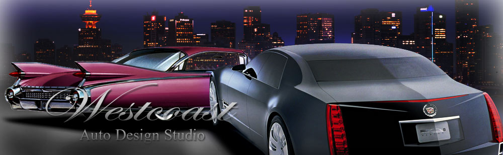
Cadillac Sixteen was a concept car which was introduced in 2003.

It had  V16 engine which had been absent since 1940.

Particularly, I don’t think it is beautiful design….but there are quite a few good design composition in this design.

First of all….the line of C-Pillar and shape of rear door glass ( also a part of C-pillar) is amazing.

I don’t like the extremely long front end…..but the overall design is quite well done.

I would say it is the last Cadillac which had good traditional Cadillac design.

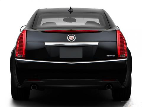
Then, what we got in the market is……CTS, STS, DTD…..and latest XTS.
They were showing the future design of Cadillac by Sixteen….but what we got after Sixteen were just crappy Lego toy like design which completely destroyed the traditional culture of Cadillac and trying to be tasteless cultureless Lexus or something.

They have good designers….but they can’t do good job. That is the major problem on Cadillac.

Cadillac has always been Prestige cars and nothing else. It is impossible to be sporty car or BMW 3 series. Before they try lots of unsuccessful new projects, they should make best prestige cars instead.

What GM is doing is exactly same as Harley Davidson trying to make 250cc spot bike.

Cadillac Sixteen Modified

This is my Photoshop project which I modified Cadillac Sixteen to make more realistic.

I’d like this kind of Cadillac rather than XTS which lools like Prius or something.

<<Go Back

Chevrolet Caprice….C pillar destroyed whole design

New Chevrolet Caprice which came out in 1990 was shocking to every American people.
Almost everything was carried over from the long going previous model which came out in 1977 apart from its completely new weird body style.

Chevrolet Caprice Front view

A year later, Mercury Grand Marquis came out with more traditional looking and all the customer was taken away by Ford and Caprice was mainly used as Police or Taxi.

It has been over 20 years since this thing came out and it is quite hard to find one of those today.

I saw one on a street and what do I think now? Still ugly is ugly…..It was called “Beached whale” old days.

Chevrolet Caprice Rear view

A year later, Big brother Buick Roadmaster was added to the line and was looking much better than Caprice.

What is the difference?

Buick Roadmaster Front
From the distinctive curvy A-pillar, it is obvious this is sharing the same platform.

Well…..it has bigger grill….. let’s look at the rear…….

Buick Roadmaster rearIt is looking much more respectable….isn’t it?

I can see the biggest difference is the shape of C-Pillar.
Let’s try some experiment…..I matched up Buick Roadmster’s C-Pillar onto Chevy Caprice by Adobe Photoshop.
Chevrolet Caprice Modified 1

Look at this…….isn’t it amazing? Those 2 are looking totally different design….but just using Roadmaster’s C-Pillar really changed the Caprice’s sloppy design. Nobody would call it “Beached whale” anymore!!img_858174_29863938_7

This is not bad at all. Later on, they modified line of rear fender and quarter glass, but it still did not improve a lot. This was how they should have done much earlier.

Chevrolet Caprice Modified 3
This is the one I modified around the tail lamp. It also changed the image quite a bit.
This series was not  popular partly because even 20 years ago, full-size cars were out of style. But, still the biggest problem was Caprice’s style.

Then, they produced Buick, Olds, Pontiac and Cadillac later on…..but obiously we could tell those were Caprice with tons of make up.

In case of Ford, Lincoln Towncar first came out, then Mercury and Ford came out later. It was better way to do and also they were better looking.

That was how GM lost in this market and withdrew in 1996. Then after that, Ford dominated this market…..but they did not do anything new and just kept aging and kept loosing customers and finally, all the Full-size Ford was seized in 2011.

This generation of Caprice was ugly….it was just because of the C-Pillar. This is good case study to say how important the shape of C-pillar is.

By the way this Caprice had Station Wagon as well and was looking way better. It was also because of the shape of C-Pillar.

Honda CBX250RS….Ladies don’t like girly design.

Honda CBX250RS

CBX250RS….downgraded cheap girly design was hated by ladies who were supposed to be the main customers.

I got to tell Car designers “Girls don’t like Girly design!!

Honda CBX250RS was a 250cc single cylinder sport bike introduced in 1983.

Honda_cb250rs

Honda CB250RS….it was slim & light….but it was quite sporty looking too.

The previous model CB250RS was a really nice bike. It only had 25PS which was lower than Honda CB250Twin…but it was nearly 50kg lighter. Combination of light slim body and responsive single cylinder created quite sporty feeling and that was how it was loved from experienced rider to lady riders.

Also the design was downsized CB900F which was one of the most popular sport bike at that time.

Then, 3 years later, the updated CBX200RS came out with stronger chassis and 5PS extra with DOHC head.

But somehow….it was not popular at all.
It came with starter motors and it spoiled the character of the previous model.

CB250RS was kick-start only with light weight body….it was purely sporty charactor…but just adding extra starter motor spoiled it.

Secondly  the vibration. When they developed previous model, they were not particularly interested in “Taste of single cylinder”.

It was only because the engine was carried over from off-road bike and also was the only engine a part from heavy & aged CB250Twin engine.
But lots of people liked the engine.

So, what Honda did was….increased vibration on purposely. This was not as nice as previous model.

Then, the biggest problem was…..they misunderstood the customers.
Previous model were quite popular with girls….that was true…..then they did girly or cheap design for this model.

This is the important point.

Girls who take motorcycle license and spend big money for motorcycle don’t like girly design.

So, this model was not popular with girls and of course was hated by experienced riders too.

Recently, Toyota launched Toyota Crown with Pink color…..they did the exactly the same mistake.

Young people who spend big money for Crown won’t buy cheap crappy looking pink car.

When Japanese designers try to attract girls, they always do cheap crappy design instead of chick sophisticated design.

What’s the problem you guys?

Car Design…Dodge Challenger

Dodge-Challenge-original

Dodge Challenger was known as a muscle car which was launched in 1970 and it came back to the market after the long absence since 1974.

Lets check at this modern muscle car today.
I would say it is not that bad….at least way better than Mustang or Camaro…..but this one still has the same problem with those other competitor.

First of all, why do they have to make Door Glass so small?
All the window is mounted very high and glass area is small…..that makes me feel really cramped although it has enough space.

You got to know I am only 5.8 feet tall and 130lb……and still feeling cramped. What about average American people?
Dodge-Challenger-modified

That is how I did some modification by Adobe Photoshop.

As I told before all the window is located very high that is because of the extremely thick body.

Also because of the low roof…..those 2 are making glass area extremely small.
So, I sliced the body to reduce the height, then  lifted up entire roof to keep the space utility and also increase the glass area.

Also the angle of front windscreen has been lifted up slightly.

Maybe the original one looks more massive…or more powerful……but I just could not stand the high and small glass area.

Some reason,all the Americans are like that these days.

Also I reduced some gap between tire and wheel arch.

American muscle cars used to be roughly made….but those day, petrol was dirt cheap and at least they had reasonable space.

But today, the situation is totally different. They can’t do that kind of rough design anymore. It is good to bring back the legacy…..but at least they should keep the basics of car design.

I am not telling to make like 4 door sedan. I am just telling just small thing can make big difference and it will create extra value. That’s all!

Back to Home>>

2014 Chevrolet Impala

<< Go Back to HomeChevrolet ImpalaAmerican cars are ugly……honestly, past 10 years, they have been horrible.

But when I first saw the 2014 Chevrolet Impala…..at least it does not look too bad.

Current Impala is the last of GM W-platform and after that, they are completely shifting to GM Epsilon platform which was originally developed by poorly named Opel.

Chevrolet Impala 2

But….look at the style! Recently, I was really fed up with crazy new Toyota design or other GMs. But at least, this is quite normal.

From the shape of leaning rear windshield, the head clearance won’t be very big….but it is not too bad.

Being normal is a good thing.Chevrolet_Impala_--_12-26-2009Current model did not have anything we could call “design”. Compare to it , the new one is quite well-done.

This was designed after the bankrupcy. It means they had no more Pontiac !! Such a  great news!!

Pontiac and Chevrolet were always in the similar kind of market and it also meant to be Chevrolet had to be more basic or boring look compare to Pontiac.

But now, they don’t have to worry about it. Chevrolet is the only brand in that class in GM. I am sure that changed design of Chevrolet.

A few years ago, when they announced the withdrawal of Pontiac, I thought it was going to be a good idea and was going to be a good chance for Chevrolet.

Maybe it was right.

Now, Cadillac XTS, Buick LaCloss and this Impala are using GM-Epsilon platform….or so as smaller Buick Regal or Chevrolet Malibu.

Now, those are the biggest American Sedan and also Impala is the only Chevy comes with V6 engine!!

Time has changed and Chevy used to be cars for young people….but now, most of Impalas are for Yellow cabs or even smaller Malibus are for senior people.

Old days, Cadillac came out with coolest design and later on, Chevy came out with similar design with previous Caddy….that was the market strategy.

But now, nobody respects Caddy and now….even Impala is looking better than Caddy XTS.

Cadillac_XTS
More expensive Cadillac XTS looks worse…… Continue reading

2014 Lexus IS

2014 Toyota IS

2014 Lexus IS was introduced at Detroit Auto Show about a week ago.
Lexus IS which was called Toyota Altezza in Japan was first planed as sporty RWD sedan for young people.

Since 80s, all the mid-range sedans shifted to FWD and in 90s, there was no young buyers in that class.

Even Honda Accord which was originally targeted to young people shifted to higher class and the average buyer were getting older and older.

That was how, Toyota tried to attract young buyer to 4 door sedan. That was the original idea of the Altezza…….but….

  • It was too expensive for young people.
  • It was not as sporty as people expected
  • The design especially interior was childish for people who could afford.

That was how, they could not attract nether young buyer nor wealthy people.

So, after that IS shifted to more luxurious market and this is the 3rd model including the original Altezza.

But again…..the average buyer of Lexus is getting older and older. That is how they are now trying to attract younger generation.

But…..what a hell is this? The grill looks like snake or something.

Recently, Toyota had big change about the design department.
Before, they had too many design assessments and that was creating Toyota’s dull & boring design.Now, they stopped that and the president of Toyota, Mr.Toyota says

“I understand car design”.
“I will look after design department.”

Actually, this is quite dangerous thing to do.
Because in Japanese society, design department will have to listen to president even if he is not right.
Also nobody want to risk to argue with president.

President does not mean he has good sense although he think he know about car design.

I introduced Toyota Crown  before and this is famous about Mr.Toyota visiting design studio all the time to complain.

What did we get for that?

Toyota design is in very difficult situation. They are trying to be something new….

But it looks like meaningless sharp lines are tangling up for no reason.

I especially don’t like the grill which looks like snake or something. There is completely luck of accent.

2014-Lexus-IS modified
I just did minor modification by Adobe Photoshop. Even this makes way better than the original.

Well…I still don’t like the “Spindle Grill”.  Two lines running from bonnet are ending at the grill….well…it is not that bad…….then, suddenly changing the direction. It is just unnatural.

They are trying to be distinctive, but distinctive does not mean to be beautiful. Harmony is the important thing that Toyota is completely missing.

Remember the 1996 Ford Taurus!                                      Go Back>>

Toyota Crown….the Japanese Prestige

Brand new Toyota Crown

Brand new Toyota Crown with President of Toyota

Toyota Crown has been the Japanese Prestige since 1955.

The first Toyota we had in North America was the Crown in 1958….well it was not good enough for American road at that time.

Then, this is the latest version of Toyota Crown introduced yesterday!!

Wow…..what kind of color is it?
Same as Cadillac, average age of Crown owner is getting older and older. So, they tried to attract younger drivers this time.

But, first of all, young people won’t afford $40,000 or $50,000 price tug.

Even if they could, who is going to buy that kind of color?
Japan has history of Boy racer and it looks like those Low IQ boys racer. But those people never buy brand new cars. They just buy cheap 2nd hands and ruin it.

They are simply misunderstanding the market.
This is simply ugly and it is not something young people expect.

President of Toyota has been saying he understand design and he is controlling design department as well.

This is showing how useless he is as “design specialist”.

Trying to attract young people is OK…..but it is better not to ruin what they already have.

1959 Cadillac Eldorado

1959 Cadillac Eldorado

Or, is it what they wanted to to be……???

Infiniti M….Good design sketch for wrong car

When I was skimming American car magazine “Road & Track” , I saw a very impressive design sketch on an Ad. of Infiniti ( luxury brand of Nissan).

infiniti-rough-sketch

I was surprised about Nissan having such a capable designer….Look at this….such a simple, strong and elegant line….!

At least, I am not impressed about Nissan design at all especially past 10 years. GT-R, Skyline etc……they even can’t design RWD large coupe which supposed to be easier.

Look at this line…….at least I can say it is way better than their proud GT-R.

But, when it come to product…..what we get is this……

infiniti-m

Such a disappointing…..First of all, I don’t understand why they used this sketch for 4 door sedan? It is for 2 door coupe line.

Original simple line has gone and too many unnecessary curvy lines are fighting each other…….

To make it adjust to 4 door, they had to lift up the roof line and that completely destroyed the balance.

I always say “roof line to C pillar is the key point of car design”.

  • When they started thinking about space utility, they had to lift up the front windshield and that destroyed the harmony between the body to roof line.
  • Then, they just lifted up whole the roof line without much thinking.

For try, I matched up the photo of Infiniti M on top of the Image sketch. It was surprising……the body line except for the roof completely much to the first rough sketch!!

Also matching with the body of Infiniti M and the roof line from sketch is perfect!!
Infiniti M body with Original Sketch

It does look like Aston Martin or something…..!

This means the body design was not that bad…..just matching with the roof line is not good.
At least I can see Nissan still have designers……but maybe they don’ t have a good environment to do what they can do.

They should have used this image sketch for GT-R or Skyline 2 door coupe.

I have to say they used good design sketch for wrong car.

Simply, I don’t like Nissan’s design especially after Carlos Ghosn started to control Nissan. They are just complicated for nothing.

Car Design….Cadillac CTS…cheap & ugly LEGO toy

2008-Cadillac-CTS_Front_viewCadillac CTS…….the top selling Cadillac today. At least they say the average age of Caddy owner has come down to 50s compare to a decade ago, it was about 70yo.

This means Caddy’s attracting younger buyers rather than people in retirement home in Florida.

What’s an aggressive face! It is going to scare old people away!

Is it beautiful? Is it elegant? Is it luxurious? Is it spacious…..?………The answer is “No”.

Last 10 years, Caddy has been trying to deny their 100 years of history, then trying to be more like Lexus, Acura or something. Actually, it looks more like “LEGO” toys.
Cadillac_CTS_Front_view_2Angler like Lego toy, narrow and cramped…….I don’t see any item to show it “Beautiful”

Look at the how bad the proportion is…….the widest part of this car is front fenders…..compere to that, see how narrow the cabin is……..that is why this car looks extremely small for the actual size of the body. It reduce the interior space significantly as well.

I am only 5.8 tall and 120lb….then, I am still feeling it cramped.

Cadillac CTS………..Length :191.6 in  Width : 72.5 in  Height: 58 in
  Lexus ES ………….Length: 191.1    Width: 71.5       Height: 57.1

It is amazing !! Lexus ES is a smaller car !! Which do you think is roomier or more luxurious?
The crisp lines designed by ruler, cramped & uncomfortable interior, and expensive…….Do you want to buy it?
I’d say “No way!”
2008-Cadillac-CTS_ModifiedThis is what I modified by Adobe Photoshop. Cabin Width has been expanded. That will expand space especially around passenger’s shoulder to elbow which is extremely important to create comfortable cabin space..That also expanded the Width between headlights.
Although I hate the shape of headlights, it looks wider and more stable as well.
Grill has been a little bit pulled up as well because I did not like the position of the original.It is the same on the rear shape. Vertical tail lamps look good with wide body width…..but with the narrow width like CTS, it makes it look narrower.
Cadillac CTS rear view
This one reminds me Honda Prelude from early 90’s. But remember, CTS is a Luxury sedan, not a sporty coupe. It is exactly the same as the front view.
Again, for the rear fenders….the widest part, the cabin width is way too narrow.
Cadillac CTS rear view modified
For this image, I expanded the width of the Cabin and the width or luggage space. That also expanded the width between tail lights as well. What I can say is…..
Designers didn’t know how to design within the limited size.
Old days, American people did not know how to design small cars because they did not have to worry about the size at all. But it was 4 decades ago and they still haven’t learned small cars design yet.  Bigger than Lexus ES or BMW 5 series, but CTS looks much  smaller, cheaper and also has cramped interior. That is mainly because of the wrong proportion as I explained in this topic. There are so many things to do for Cadillac, but first thing they have to learn is……again “Right Proportion”.
Also they need a bit better finish for every exterior items. It just looks like cheap ugly custom car.

Car Design…Chrysler Crossfire

Chrysler_Crossfire_original designChrysler Crossfire was the joint project of Mercedes and Chrysler.

It is using Mercedes SLK chassis and engine, designed by American designer, Assembled in Germany and sold by Chrysler.

German and American worked together and what is the result?
If I talk about the design, I was not really sure if it is beautiful or ugly…..I haven’t heard someone criticizing this design…but honestly, I did not like it.

The front end just look like average Chrysler….but how about the distinctive rear end?
Tell the truth, you could find this kind of shape from old MGB coupe. If you think that way, maybe this is a kind of “Retro style”.

But, honestly, It was better to be more “normal” design.

Chrysler_Crossfire_modifiedThis is what I modified by Adobe Photoshop.

All I did was…..just pulled out the rear end. But, isn’t it perfectly balanced?
I guess this was the original idea and later, they tried to make it more distinctive.

As reality, Crossfire struggled with the slow sales and Roadstar, which looked more normal was more popular than this odd-looking coupe.

I can say this is typical bad example of joint business. All they got was negatives of Mercedes and negatives of Chrysler with odd design.

I have one thing to say.

If you don’t know what to do, go back to basics!

There is a comment from Jeremy Clarkson from Top gear said this rear design “Dog is doing No.2”.